Happy Wednesday, everyone! Today I'm talking about something that hits kinda close to home: Actions and Reactions. No links to click today, so you can just sit back and read along with your cup of coffee or tea, and try to enjoy yourself. Ready? Let's get going!
As a self-published author, your attitude, actions, and everything connected to you is part of your brand. I'm not talking about visual branding, we all have logos or something like that. What I mean is the feeling someone gets when they see you or your books. It's that intangible thing that connects you to the people you count on to make a living: fans.
I see a lot of authors shooting themselves in the foot with the way they behave when something happens to them. Someone does the author wrong, and a rant is shortly thereafter posted somewhere the general public can see.
Why does it matter?
Because when you have a visceral reaction to something and blast it all over social media, it follows you forever. Not for the moment, for the week, or for the month. It's searchable for the rest of your life.
This article by an acquisitions agent spells it out in plain words: you will be researched if you submit a book for publication consideration.
That means the agent is going through all your social media accounts. They'll check you out well. If you've behaved badly, it's likely your book will hit the trashcan without another thought.
Authors have to be careful. I recently saw a post on Facebook where a very popular blogger asked the general public what would turn them off a writer's work forever.
Know what the number one answer was?
Yup. A rant by the author on a public space. Didn't really matter what the rant was about, either. You rant, and fans leave. There are so many authors out there for readers to choose from, they don't have to stick with you and your books.
Keep that in mind.
Also consider the ramifications of your actions to the human you're reacting to. We're all human. We all screw up sometimes. Does it really need to be made public?
Why not choose to be the bigger, better human?
I understand the desire to lash out at someone who's made you angry. You have every right in the world to do so.
Just, maybe, do it privately. A little Grace will go a long way.
God forbid you walk into a room and everyone points and whispers, "There's that author that bashed XYZ. Can you believe she had the nerve to show up here?" And all the while, you're thinking they have good things to say. You smile and they smile back. But it was that one time, that one thing you did, five years ago, that was so egregious people can't forget it.
It's easier to remember the bad things about a person.
I learned the following when I was in training for a customer service position at a major tel-com company: When someone loves you, they'll tell a couple of people. When you screw up, they'll tell anyone who'll listen.
Truer words were never spoken.
Your books are your business; don't give them a bad name by doing something because you're angry. It doesn't go away.
What advice do you have for angry authors? Talk about it!
Well, that's all for today, folks! Until next time, WRITE ON!
Jo
A blog dedicated to the education and support of Indie authors.
Also striving to providing great book recommendations and reviews for readers.
Links and Books by Jo Michaels
Showing posts with label branding. Show all posts
Wednesday, May 27, 2015
Tuesday, July 8, 2014
Branding Yourself - A Whole New Level
Happy Tuesday, everyone! I'm back to the grind and feeling good about it. It's been a heck of a last month or so, getting moved, attending UtopYA Con, and going on vacation, but routine is something I thrive on. Blogging is part of my routine. It helps to wake my creativity, gets me writing something, and is my little contribution to the writing world. As you can see from the number of posts under recent months, I've been slacking. It wasn't because I didn't have a desire to blog or was out of topics, but because I had to let something give (hey, you were warned). So, today, I'm gonna talk about something unexpected that happened at the con, but threw me a bone in the process. Ready? Grab your coffee and let's get going!
Day one, I'm meandering around the hotel lobby with the fabulous Tia Silverthorne Bach. We pretended to be regular people, and didn't tell anyone there we were authors until later.
I never thought about it at the time, but I was wearing my hat (see blurry as hell photo). This hat almost didn't make it. I had to run back into the house and grab it from its spot on the floor of my room. I'd put it there so I wouldn't forget it.
Why was I taking my hat?
Well, cowboy hats and Nashville, Tennessee, go together like peas and carrots or peanut butter and jelly, if you will. I was born in Tennessee and will always have a deep affection for my birthplace. Besides that, my husband is the one who bought me that hat, and I wanted to have a little something he gave me along for the ride. I digress. Let me get back to the main idea.
When I finally introduced myself as Jo Michaels, everyone commented on my hat. Once I got my name tag, my hat became more of a branding thing because I put that tag on the brim of my hat (you can see the edge of it).
Was this branding intentional?
No.
But it worked. Every time I saw someone, they knew who I was at a glance. If you've perused the UtopYA photos, you'll see my hat on my head in almost every one.
Saturday, I showed up without my hat on.
People told me they didn't know who I was, and to stop trying to trick them. Even though I had on my Jo Michaels t-shirt, people didn't recognize me without my unintentional brand of a cowboy hat.
There were a lot of people there with something unique going on. Misty Provencher had the prettiest face paint I've ever seen, making her look rather like a fantastical fairy. Bella Roccaforte had fire-engine red hair. N. L. Greene had a pretty pink streak in her blonde locks, and Sarah Ashley Jones had her signature purple, blue, and white bob. Yeah, you knew who they were at a glance.
This is what I'm talking about. You need a strong brand so people will recognize you at one of these events. Remember, they're meeting a ton of people. What makes you special/unique?
Find something and go for it.
Be your brand. Embrace your difference.
Will I be wearing my hat next year?
You bet.
Have you ever unintentionally branded yourself with something? What was it, and how did it work out?
Well, that's all for today, folks! Until next time, WRITE ON!
Jo
Tuesday, February 4, 2014
Most Popular Posts of 2013
Happy Tuesday, everyone! I know, I know, I'm late. But, I have good reason. This morning, I had a meeting with Ms. Sandi Tuttle, a dentist appointment, and a very sick child to contend with. Onward and upward! Today, I'm going to give you all links to some of the posts on my blog that have had the most traffic. They're probably the most useful posts, too. Strap in, get your fingers ready to do some clicking, and let's get going!
Because all posts are better with a cute baby with cake on his hands and feet.
Up first, I'm gonna give you my two free PDFs. These have been downloaded a lot and are free for you to keep and share, providing you don't change any of the content.
This one is on Branding Yourself.
This one is a A Novel Checklist.
Now, we move on to the posts!
Monkey Wrenches
Dialogue Tags vs Action Tags
Pesky Pronouns
Human Nature Series (last post)
Enneagram Personality Types
Comma Part 3 (links to part 1 and 2 included)
Timeline Tips
Common Editing Errors
Templates for Using MS Word for Print
He Said, She Said, Who Said What?
Love those? Here's a page with them all (plus others that didn't get as much traffic but are still just as useful). I even categorized and summarized them. Yup, all for you readers.
Thanks for making 2013 awesome. I hope to bring just as much great content in 2014!
Well, that's all for today, folks! Until next time, WRITE ON!
Jo
Labels:
author,
author blog,
author branding,
authors,
book marketing,
branding,
checklists,
editing,
editing tip,
how to,
jo michaels,
marketing,
novel writing,
on writing,
printable checklists,
writing tip
Wednesday, March 27, 2013
Happy Wednesday, good people of the blogosphere! Boy, do I have some amazing news for you today. Do you remember the Winter Author Blog Challenge and all that social media stuff we were talking about? If you have a mobile device, I'm about to make your millennium oh so much better! I've been holding off discussing it until now because I was waiting for their upgrade to be announced.
I got the e-mail this morning.
What is Flipboard? Well, it's a nifty little app that lets you keep all your social media accounts in one place and helps you find stuff you may be interested in. If you listened to my interview on Sandi Tuttle's radio show, you heard me talk about this awesome tool. If not, then you missed out. Sorry. Like I said, I was waiting to do a post on it until they updated to add this awesome feature I'm about to discuss. Let's get going!
Grab your mobile device, download the FREE Flipboard app, get all signed up with an account, and take a tour with me while I show you how to promote yourself!
Follow along carefully:
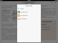
Next, click on the green square that says Google Reader and you should get a page that looks like this but have all the blogs you subscribe to.
Click on the title at the top of the page and select feeds and folders.
Select your blog from the list.
You should now have a page that looks like this but with your blog posts showing.
Now we get to how this can help you. Flipboard just added the coolest feature ever: Magazines of your curated content. See those little + signs in the top right of each post? Click on one and create your first magazine with your blog posts. You should add a description and categorize it. Then, go add all your posts to it and make it public!
Others can now find your magazine and browse it with ease. Be sure your image is your logo or branding headshot. Boom! You just reached millions of potential new followers! Best of all, you can also add Facebook content, Twitter content, and many other things to your magazine that concern you and your brand! You may thank me now. Hehe!
Go curate for others, too. Remember, sharing is caring!
Did you use Flipboard before now? Did you know it existed?
Well, that's all for today, folks! Until next time, WRITE ON!
Jo
I got the e-mail this morning.
What is Flipboard? Well, it's a nifty little app that lets you keep all your social media accounts in one place and helps you find stuff you may be interested in. If you listened to my interview on Sandi Tuttle's radio show, you heard me talk about this awesome tool. If not, then you missed out. Sorry. Like I said, I was waiting to do a post on it until they updated to add this awesome feature I'm about to discuss. Let's get going!
Grab your mobile device, download the FREE Flipboard app, get all signed up with an account, and take a tour with me while I show you how to promote yourself!
Follow along carefully:
- Go subscribe to your own blog via RSS/Atom
- Add it to your Google Reader
- Open Flipboard and add your Google Reader as one of your tabs. Then follow the directions below:
Next, click on the green square that says Google Reader and you should get a page that looks like this but have all the blogs you subscribe to.
Click on the title at the top of the page and select feeds and folders.
Select your blog from the list.
Now we get to how this can help you. Flipboard just added the coolest feature ever: Magazines of your curated content. See those little + signs in the top right of each post? Click on one and create your first magazine with your blog posts. You should add a description and categorize it. Then, go add all your posts to it and make it public!
Others can now find your magazine and browse it with ease. Be sure your image is your logo or branding headshot. Boom! You just reached millions of potential new followers! Best of all, you can also add Facebook content, Twitter content, and many other things to your magazine that concern you and your brand! You may thank me now. Hehe!
Go curate for others, too. Remember, sharing is caring!
Did you use Flipboard before now? Did you know it existed?
Well, that's all for today, folks! Until next time, WRITE ON!
Jo
Friday, March 22, 2013
Branding Step Five
Happy happy Friday, good people of the blogosphere! On to the weekend! I hope I've given you enough information this week so you'll have a branding project to work on for the next couple of days. Today is all about look and feel. So, grab your pens and notebooks and let's get going!
What is look and feel, anyway?
To put it simply, look and feel is the consistent look of your presence and the feeling a visitor gets when they come to your page or see your ads. If you saw an ad belonging to Jo Michaels somewhere, you'd know it was mine because of either the logo or the color scheme. Polka-dots be damned, mine are specific colors. This is what you should be striving for.
Even my mobile site is consistent with the rest of my marketing. Yes, it matters.
I want people to feel like they're having fun when they visit my sites because I'm a fun person. Think about what you're projecting with your colors and design. Is your site stodgy and boring? Are your colors saying what you want them to? There have been deep looks into what feelings colors incite.
Take a look at this:
Yes, click it and view it full size. Keep it if you like. But, above all else, remember it when deciding on your color scheme. If you notice, the colors in my logo are blue and brown. I added peach (a tint of orange) to the backgrounds of my sites. Now you know why.
The feeling your pages incite matters. People want to feel happy when they pay you a visit. Let them, help them, show them the way.
Now you know what look and feel is; make sure you're using it for maximum impact.
Come on back Monday when I'll be giving you all a look into what I accomplished this week with my social networking schedule.
Well, that's all for today, folks! Until next time, WRITE ON!
Jo
Thursday, March 21, 2013
Branding Step Four
Wow! It's Thursday, good people of the blogosphere, and you made it over Hump Day. Just one more tiny day to go until the weekend will arrive! Can I hear some celebration, please? Continuing with my branding sequence of posts, today we're discussing naming. You're right, this could've been day one, but I wanted you to start thinking about the pictures related to your brand and to get excited about the possibilities before I dove headfirst into names.
IF you're a writer and you're using a pen name, one of the things you have to consider is your genre. It's only a half joke when you do the little test to determine your erotica writer name. Something like Bunnie Whipshard is a pretty telling pen name. Plus, the logo possibilities are out of this world.
Ha ha! Sorry, images of bunnies with fluffy tails and dominatrix masks just passed through my brain. Moving on...
As my example above shows, your name makes a difference. But, when thinking about your mark, you want something that's going to stand out in the crowd. If I'd wanted to take my logo in a fun direction, I probably would've used a cup of steaming coffee (Jo = Cup of Joe = Coffee). See the correlation? My tag line could even have been something like: Jo Michaels Blog - Your Daily Cup of Joe. But I find coffee cups as logos to be way overdone; besides, I'm not a coffee shop.
When thinking about your naming, consider how it might be possible to move your logo from one thing you do to another. If you're an expert on something, consider using an image related to that expertise. Let's take a look at my friend, Sandi Tuttle, from The Average Woman in a Superwoman World blog. Here's her blog banner:
Her logo is an average female icon, used on many bathroom doors to indicate women, with a superwoman cape draped around her shoulders. It's simple and effective. Her blog is about making average women the best they can be, inside and out. It's fitting, huh?
This is a great example of branding! That logo appears on her blog, radio show site, Facebook, and products. When I got her coffee mug with the "If I have wings... Why can't I fly?" quote on it, her logo graced the other side. No matter what facet she places herself in, she'll always be the average superwoman.
It's this type of branding and naming we should all be embracing. If we use these tools to their full potential, we'll be instantly recognizable no matter where we show up.
Let me give you one more example before I let you go!
If your name is Bunnie Whipshard, and your mark is that bunny with the dominatrix mask, you could brand it like this:
Bunnie Whipshard - Author
Bunnie Whipshard - Photography
Bunnie Whipshard - S&M Techniques
Bunnie Whipshard - S&M Toy Design
Do you see where I'm going with this?
Have you thought about your name and what a mark associated with that name could do for you?
Come on back tomorrow to catch the post on look and feel!
Well, that's all for today, folks! Until next time, WRITE ON!
Jo
Wednesday, March 20, 2013
Branding Step Three
Happy hump day, good people of the blogosphere! How lovely is it our week is almost half over? Very! Today, we're talking about what your logo says about you. So, grab those pens and notebooks and let's get going!
Here are a few of the logos I've designed and a few belonging to major corporations. Let's take a look and see what they represent.
Anyone see the surveyor's mark and the fun I had playing with the typography on this one?
This one is pretty obvious, no? DNA design, again, repeated in the typography. Like a computer doctor.
Fictional company. Logo is to represent movement forward in new construction techniques and residential windmills. Go green! The blue is to represent the sky.
This one, I love. Green to represent growth. Roots to represent stability. This community club has been around for six generations that keep branching off. Movement representing the wind on the ridge from left to right.
My own INDIE Books Gone Wild logo. Strong type with the indie and the book embracing one another. Our red color represents wildness yet we bring that stability and guarantee through in the black.
Now go take a look at McDonald's. Those golden arches represent bent french fries. Bethcha never thought of that, huh? Nike? The swoosh is representative of the wings on the god's shoes. Pretty clever!
So, what does your logo say about you? Mine was designed to represent flourish like a quill pen and stability like a solid letterform. See how the M wraps around the J? Blue is my favorite color, and my mark will emboss beautifully on that hardcover book someday.
If you're using an image as your identifier, think ahead to your business cards and printed materials. You can add a mark to an image and later use it as a standalone. Think about color, voice, and what you're saying about yourself with your mark. Come on back tomorrow and join me to discuss naming!
If you don't have a mark, why? Is it because you don't know how to make one or you don't think you need one?
Well, that's all for today, folks! Until next time, WRITE ON!
Jo
Tuesday, March 19, 2013
Branding Step Two
Happy Tuesday, good people of the blogosphere! This week is all about branding yourself with a logo, design, color scheme, name, and look and feel. As promised yesterday, I'm going into color schemes today. Grab your pens and notebooks and let's get going, eh?
You're probably most familiar with RGB (that's Red Green Blue). These colors are created with light. What you're looking at on your monitor is not what you'll see in print when using a CMYK (Cyan, Magenta, Yellow, Black) printer. Why? Because these colors are created with ink.
It's a long, drawn-out process so I'm not going into all that. What I'm going to do is break it down and explain why you only want two colors plus black in any print job you send to a traditional printer. I'm also going to tell you a little about spot colors (PMS colors).
Now, your printer at home likely uses RGB (unless you're using one with individual cartridges for each color). This means your colors will be close to what you see on your monitor (if it's calibrated).
Big printing houses don't use RGB printers. They do a print run and lay down each color individually with each run. So, if you have a three color print job, that's three runs through the press. It costs you money for each run of your print job through the printer. More colors = more runs = more money out of your pocket.
It may be okay if you're only having fifty business cards printed. But what about when you have two thousand done? What if you want to have fliers or postcards printed? Now you're talking a lot of money.
You see my color scheme in my logo on the top left of my website. It's Brown and blue. Leave off the peach because I can remove that and still be two colors. Notice the peach doesn't appear in my logo/mark.
Most companies have one PMS or spot color in their logo and nothing else but white (or the paper color it's printed on). When you use white, you're opening yourself up to a lot of color issues because paper comes in a lot of colors and white is the absence of ink. A PMS color is often the only way to get that brilliant red, blue, or orange when printing.
Ever design something bright and have it come back from the printer looking dulled out? RGB to CMYK conversion does it every time. If you're designing for print, you should be working in a CMYK color space always.
Home Depot is an orange color. Coca~Cola is a special red (has a copyright, even). UPS-brown. You see where I'm going here, right? One color is sometimes all you need.
But, sticking with my original guidelines, check out these identity packages I've created:
The first uses only one color. Black could be added at a nominal cost. The second is two colors plus black. I know the leaves on the trees look like they're three colors, but they're just tints of the original color (a lighter version). By the way, black is CHEAP! You should see the brand standard book for the second identity package, it's huge.
So, what should you take away from this? That your logo should be harmonious and encompass no more than two colors plus black. Ever. Period.
I hope you got some useful information from this post. Tomorrow, we'll go into design and what it says about you. Many logos and marks have hidden meanings! Yours could, too!
Well, that's all for today, folks! Until next time, WRITE ON!
Jo
Monday, March 18, 2013
Branding Step One
Happy Monday, good people of the blogosphere! This week I'm gonna talk about branding yourself. No matter what business you're in, it's a good idea to have a brand; something that says, "Hey, look here! It's me and there's no doubt about it!" Today's post is all about having an image. So, grab your pens and notebooks and let's get going.
If you've read my book The Indie Author's Guide to: Building a Great Book, you'll know branding is the first thing I discuss.
Why is branding so important? Ask McDonald's, Nike, or Coca~Cola. Those golden arches, the swoosh, and that pretty red color are instantly recognizable. No matter where you are, those are branding standards.
These companies have entire books on how their logo can be displayed, used, and colorized. If you take a peek inside the book, you'll see the requirements of size, space around the logo, and color options. Here are a couple you should look at: UPS, McDonald's, Twitter, and Facebook. You can look up any brand you may be curious about by typing the company name and the words brand standards into a Google search box.
You should also have a brand standard. Your logo or headshot, used as an identifier, should have some sort of requirement when shown to the world by others or yourself. It's helpful to have a standard when asking a designer to build something for you.
If you don't have a logo or something akin, you may want to contact a designer or photographer and see what can be done about it. A good designer won't just shove a logo at you. They'll give you an identity. Once you have one, use it everywhere.
Tomorrow, I'm going into color schemes and why companies try to keep it simple (and why you should, too!).
Well, that's all for today, folks! Until next time, WRITE ON!
Jo
Friday, March 15, 2013
Social Networking Schedule - Day Fifteen WABC
Happy Friday, good people of the blogosphere! Today is the last day of the Winter Author Blog Challenge. I bet you've noticed the influx of discussion on social networking sites, eh? Over the last fourteen days, we've discussed Blogs, Facebook, Twitter, LinkedIn, Pinterest, YouTube, Google+, Quora, FourSquare, GoodReads, Squidoo, StumbleUpon (amongst other social bookmarking websites), and Ning. It's been one hell of a couple of weeks! In the last few days, I saw people becoming overwhelmed by all the websites concerning social media. There were a couple I hadn't heard of, but I had a profile on most of them because I know social media works. Our prompt for today is:
What was your biggest takeaway from participating in the Winter Author Blog Challenge? What is your plan/strategy for integrating your social media platforms? What would you recommend to a new author who’s just getting started on social media?
First, I'll answer the questions. Then, I'm going to break down all this social media talk and give you some tools to help you manage your time when dealing with them so you don't have all the hours in your day sucked out by trying to be everywhere at once. Sound good? Okay, let's get going!
My biggest takeaway, as always with a blog challenge, is meeting new people and interacting on other blogs. It forces me to get out there and read and comment other blogger's posts.
I already had a social media strategy when I began, but I realized I'm not using it to its full advantage. From now on, I'll be following a much stricter schedule. One I'm going to share with you in a moment. If you're new to social media, I have one tip for you: Brand yourself across all your platforms. Whether with a logo, your face, or a cute picture of a bug, you need to have consistency. People who happen upon something belonging to you should know right away it's yours. A color scheme is a must, as is a consistent name. If you don't have an identity package, call a graphic artist today and get one. You won't regret it.
You should have a folder containing: Logo, icon, or headshot, preferred background design, html color scheme codes, and a bio. Label it Branding and never ever delete it.
If you don't have naming consistency across all your platforms, change them. This is KEY.
Now, on to the tools! We all know I love free. So everything I give you will have a free option. A couple of them allow you to pay if you want more functionality but it's not necessary.
First and foremost: Buffer and Hootsuite
I'm a huge fan of Buffer. I can go to a site, hit the buffer icon in Firefox, and schedule it to Tweet, post to Facebook, and pop a message on my LinkedIn wall with one click. It's awesome. Since I'm a free user, I get up to ten buffered posts. Best of all, I can control when they're posted. I can manage all three of those social networks for two to three days at a time by scheduling my posts to span.
Hootsuite is a little different an incorporates up to five social networks. I'm not sure if they have a Firefox plugin like Buffer, but here's a list of stuff they can help you manage:
Why is this important? Because it lets you manage all your social networking from one application. Imagine spending just one hour a day managing everything! Of course, visiting the app isn't really all you have to do. But it'll still only take an hour a day. Without further ado, here's a handy dandy schedule. If you follow it, you'll be on your way to social media ownership very soon!
Monday - 20-30 minutes for a blog post. You should have something integrated so your posts are automatically sent to your social networks when you click publish. I have the buffer button and all I have to do is click it after I post. 20 minutes to schedule posts across all media for the next two days. 10 minutes browsing Twitter and re-tweeting things you find interesting.
Tuesday - 20-30 minutes for a blog post. 10 minutes to answer a single question over on Quora. 10 minutes to share interesting things others post on Facebook. 10 minutes to visit and update your GoodReads page. Make sure you're clicking like on any reviews you've gotten.
Wednesday - 20-30 minutes for a blog post. 20 minutes to schedule posts across all media for the next two days and make sure it's all running smoothly. 10 minutes to record a video you'll use later.
Thursday - 10 minutes to upload video to YouTube. 20-30 minutes for a blog post incorporating said video. 15 minutes to create a Squidoo lens (can be about and incorporate your video as well!). 5 minutes to pin a couple of things over on Pinterest.
Friday - 20-30 minutes for a blog post. 30 minutes scheduling everything to update until Monday and coming up with blog post ideas for the next week and make sure everything is running smoothly.
Saturday - 20 minutes sharing on Facebook. 20 minutes re-tweeting on Twitter. 20 minutes to visit other blogs and pop in a comment or two.
Sunday - 30 minutes sharing on Facebook, 30 minutes re-tweeting on Twitter.
Now, lather, rinse, repeat. I added Saturday and Sunday because most people don't work on the weekends, but are on Facebook and Twitter just hanging out. Why not share a couple of things while you're at it? After all, social media is about being social, right? So many people shied away from FourSquare and Ning, I didn't include them.
Granted, it's going to take you an hour or so to get one of the above apps working in the first place. Once you do, you'll wonder how you ever got on without it. They're time savers! Use them! They're FREE!
Does this help you break it down? Does it all seem more manageable and do-able now?
Well, that's all for today, folks! Until next time, WRITE ON!
Jo
What was your biggest takeaway from participating in the Winter Author Blog Challenge? What is your plan/strategy for integrating your social media platforms? What would you recommend to a new author who’s just getting started on social media?
First, I'll answer the questions. Then, I'm going to break down all this social media talk and give you some tools to help you manage your time when dealing with them so you don't have all the hours in your day sucked out by trying to be everywhere at once. Sound good? Okay, let's get going!
My biggest takeaway, as always with a blog challenge, is meeting new people and interacting on other blogs. It forces me to get out there and read and comment other blogger's posts.
I already had a social media strategy when I began, but I realized I'm not using it to its full advantage. From now on, I'll be following a much stricter schedule. One I'm going to share with you in a moment. If you're new to social media, I have one tip for you: Brand yourself across all your platforms. Whether with a logo, your face, or a cute picture of a bug, you need to have consistency. People who happen upon something belonging to you should know right away it's yours. A color scheme is a must, as is a consistent name. If you don't have an identity package, call a graphic artist today and get one. You won't regret it.
You should have a folder containing: Logo, icon, or headshot, preferred background design, html color scheme codes, and a bio. Label it Branding and never ever delete it.
If you don't have naming consistency across all your platforms, change them. This is KEY.
Now, on to the tools! We all know I love free. So everything I give you will have a free option. A couple of them allow you to pay if you want more functionality but it's not necessary.
First and foremost: Buffer and Hootsuite
I'm a huge fan of Buffer. I can go to a site, hit the buffer icon in Firefox, and schedule it to Tweet, post to Facebook, and pop a message on my LinkedIn wall with one click. It's awesome. Since I'm a free user, I get up to ten buffered posts. Best of all, I can control when they're posted. I can manage all three of those social networks for two to three days at a time by scheduling my posts to span.
Hootsuite is a little different an incorporates up to five social networks. I'm not sure if they have a Firefox plugin like Buffer, but here's a list of stuff they can help you manage:
- Google+
- FourSquare
- WordPress
- MySpace
- mixi
- Tumblr
- Flickr
- Trendspottr
- Evernote
- MailChimp
- Constant Contact
- SocialBro
- StumbleUpon
- Storify
- Vimeo
- Scoop.it
- SlideShare
- Blogger
Why is this important? Because it lets you manage all your social networking from one application. Imagine spending just one hour a day managing everything! Of course, visiting the app isn't really all you have to do. But it'll still only take an hour a day. Without further ado, here's a handy dandy schedule. If you follow it, you'll be on your way to social media ownership very soon!
Monday - 20-30 minutes for a blog post. You should have something integrated so your posts are automatically sent to your social networks when you click publish. I have the buffer button and all I have to do is click it after I post. 20 minutes to schedule posts across all media for the next two days. 10 minutes browsing Twitter and re-tweeting things you find interesting.
Tuesday - 20-30 minutes for a blog post. 10 minutes to answer a single question over on Quora. 10 minutes to share interesting things others post on Facebook. 10 minutes to visit and update your GoodReads page. Make sure you're clicking like on any reviews you've gotten.
Wednesday - 20-30 minutes for a blog post. 20 minutes to schedule posts across all media for the next two days and make sure it's all running smoothly. 10 minutes to record a video you'll use later.
Thursday - 10 minutes to upload video to YouTube. 20-30 minutes for a blog post incorporating said video. 15 minutes to create a Squidoo lens (can be about and incorporate your video as well!). 5 minutes to pin a couple of things over on Pinterest.
Friday - 20-30 minutes for a blog post. 30 minutes scheduling everything to update until Monday and coming up with blog post ideas for the next week and make sure everything is running smoothly.
Saturday - 20 minutes sharing on Facebook. 20 minutes re-tweeting on Twitter. 20 minutes to visit other blogs and pop in a comment or two.
Sunday - 30 minutes sharing on Facebook, 30 minutes re-tweeting on Twitter.
Now, lather, rinse, repeat. I added Saturday and Sunday because most people don't work on the weekends, but are on Facebook and Twitter just hanging out. Why not share a couple of things while you're at it? After all, social media is about being social, right? So many people shied away from FourSquare and Ning, I didn't include them.
Granted, it's going to take you an hour or so to get one of the above apps working in the first place. Once you do, you'll wonder how you ever got on without it. They're time savers! Use them! They're FREE!
Does this help you break it down? Does it all seem more manageable and do-able now?
Well, that's all for today, folks! Until next time, WRITE ON!
Jo
Thursday, March 14, 2013
My Social Network - Days Thirteen and Fourteen WABC
I've decided to compile today, good people of the blogosphere! There were two prompts from the Winter Author Blog Challenge that are quite close in nature, so I'm gonna discuss them both in one post. By the way, happy Thursday! Here they are:
What if you could create your very own Facebook? A social networking site that you run, based on your interests and whose members must abide by your vision, goals, and rules? Guess what, WABCers – you can do just that through Ning.com! I know – it’s crazy. Here we’ve spent the last 12 days talking about other social media platforms, and now your kooky leader is bringing up the idea of hosting your own network. There are drawbacks to be sure. T-I-M-E being chief among them. But if you have a special interest and haven’t found the perfect social site yet, Ning offers you the mechanism by which to create your very own social network. Ning has other benefits, though – chief among them being numerous sites on all sorts of topics that may attract your target readers. Are there any circumstances under which you could see yourself creating your own social network? Take a spin around the Ning Directory just to see what else is out there. Much like blogs, you’ll find half-abandoned Ning sites (ahem … I have one of those) and thriving sites. Are you inspired? Could you find time to visit one or two in your genre just to see if hanging out might be worthwhile? And by all means, if you already have a Ning site, share the link with us!
OK, some might compare today’s prompt to yesterday’s – but they are different. This one is a little more creative than necessarily practical. Your answer doesn’t even have to be physically plausible – the goal is just to have a little fun, now that you’ve worked so hard for nearly 2 straight weeks! Here’s the question: If you could create a social media platform that doesn’t exist yet, what would it look like? What would it do? How would you use it to promote your books as well as those of other authors you know/like?
First off, let me say I won't be joining Ning unless I can round up a ton of people to help split the cost. Plans starting at $25 generally turn into much more when you add bells and whistles. But I took a cruise around the site, and those with the cash flow have done some awesome things. So, let's jump onto the real question in both the prompts above: What would your social media platform do?
My rules would be simple:
Basically, like GoodReads and Facebook combined but only one 'group' allowed. It would be a place where authors could go and add themselves and readers could go to find great books without all the mumbo-jumbo of other sites. If you see something you like, share it. If you don't, leave it and move on to the next thing. Like a bookstore online where the authors are present and giving stuff away. How awesome would that be?
It's not a realistic site, but it sure would be fun.
Tomorrow, I'm going to be presenting a list. Call it a schedule, if you will. So everyone can use every social media platform we've discussed this week and it only take up an hour a day (this includes your blog!).
Let me tell you, I've used an hour a day for over a year. In January of 2012, if you plugged my name, Jo Michaels, into Google, I didn't show up anywhere. Now, just over a year later, because of that hour a day, I'm every search result on the first page but one. Remember that video I uploaded last week? It's there already.
Check it out: Jo Michaels Google Search Results
And tell me I'm crazy. How would you like for that to be you? It's possible. Don't get overwhelmed by all this stuff. It's easy to manage when you take small bites and spread the butter thin.
Well, that's all for today, folks! Until next time, WRITE ON!
Jo
What if you could create your very own Facebook? A social networking site that you run, based on your interests and whose members must abide by your vision, goals, and rules? Guess what, WABCers – you can do just that through Ning.com! I know – it’s crazy. Here we’ve spent the last 12 days talking about other social media platforms, and now your kooky leader is bringing up the idea of hosting your own network. There are drawbacks to be sure. T-I-M-E being chief among them. But if you have a special interest and haven’t found the perfect social site yet, Ning offers you the mechanism by which to create your very own social network. Ning has other benefits, though – chief among them being numerous sites on all sorts of topics that may attract your target readers. Are there any circumstances under which you could see yourself creating your own social network? Take a spin around the Ning Directory just to see what else is out there. Much like blogs, you’ll find half-abandoned Ning sites (ahem … I have one of those) and thriving sites. Are you inspired? Could you find time to visit one or two in your genre just to see if hanging out might be worthwhile? And by all means, if you already have a Ning site, share the link with us!
OK, some might compare today’s prompt to yesterday’s – but they are different. This one is a little more creative than necessarily practical. Your answer doesn’t even have to be physically plausible – the goal is just to have a little fun, now that you’ve worked so hard for nearly 2 straight weeks! Here’s the question: If you could create a social media platform that doesn’t exist yet, what would it look like? What would it do? How would you use it to promote your books as well as those of other authors you know/like?
First off, let me say I won't be joining Ning unless I can round up a ton of people to help split the cost. Plans starting at $25 generally turn into much more when you add bells and whistles. But I took a cruise around the site, and those with the cash flow have done some awesome things. So, let's jump onto the real question in both the prompts above: What would your social media platform do?
My rules would be simple:
- No spamming
- Keep it nice or get the hell out
- Love thy neighbor
- No reviews allowed
- Have a lot of fun
- A place to do a giveaway of your books - must be free and not require purchases
- Ease of upload for book covers and a place for a link
- Book lists
- A wall like Facebook's where things are streamed as they happen
- Easy to find author lists
- Easy to find reviewer lists and their genres
- One-click sharing across all social media
- One-click linkup of all social media accounts
Basically, like GoodReads and Facebook combined but only one 'group' allowed. It would be a place where authors could go and add themselves and readers could go to find great books without all the mumbo-jumbo of other sites. If you see something you like, share it. If you don't, leave it and move on to the next thing. Like a bookstore online where the authors are present and giving stuff away. How awesome would that be?
It's not a realistic site, but it sure would be fun.
Tomorrow, I'm going to be presenting a list. Call it a schedule, if you will. So everyone can use every social media platform we've discussed this week and it only take up an hour a day (this includes your blog!).
Let me tell you, I've used an hour a day for over a year. In January of 2012, if you plugged my name, Jo Michaels, into Google, I didn't show up anywhere. Now, just over a year later, because of that hour a day, I'm every search result on the first page but one. Remember that video I uploaded last week? It's there already.
Check it out: Jo Michaels Google Search Results
And tell me I'm crazy. How would you like for that to be you? It's possible. Don't get overwhelmed by all this stuff. It's easy to manage when you take small bites and spread the butter thin.
Well, that's all for today, folks! Until next time, WRITE ON!
Jo
Wednesday, March 6, 2013
Tube Tops - Day Six WABC
Oh my goodness! It's Wednesday, good people of the blogosphere! That means just two more days until the weekend arrives! Get through today and you're golden. Still rolling along with the Winter Author Blog Challenge, and today's prompt is all about YouTube. That golden beacon in the sky, calling our names like a siren. It draws us in and holds us fast for hours. Without further ado, the prompt for today:
With more than 800 million unique visitors a month, YouTube is one of the most popular search engines. Do you have a YouTube channel? Have you made a book trailer for your book? If not, what kind of book trailer would you like to make for your book? Do you have a video camera? If you do and you’re not posting short videos, you’re missing out on a huge marketing opportunity. It’s especially useful if you’re trying to reach a global audience, as 70 percent of YouTube viewers are in countries other than the U.S. If regular video posts are still on your To-Do list, what are some of the most clever video posts you’ve seen, and how might you do something similar to promote your books or yourself as an author? Be sure to give us the link to your YouTube channel.
I've done one video on YouTube and made it private. You can only get to it by clicking on the link: http://youtu.be/ydqAJmVNa5Q I'd just woken up and look a bit like crap, but it was fun and a good learning experience. My idea was to figure out just how to do something like that from my iPad, and it went off without a hitch. YAY!
I attended a webinar last week called Book Marketing is Bull$h*t. At the start of the session, the host asked us to answer a poll. His question was: What avenues are helping you in your sales? Guess what the only option was that didn't get any votes. That's right, book trailers.
Like Pinterest, I think perhaps we're using them the wrong way. Instead of a trailer for a book, perhaps we should be exploring other options. YouTube is video, man! It has a billion (with a B) possibilities. As authors, we just need to figure out a way to tap into it and use it at its highest potential. I don't go to YouTube to find new books to read.
Ah! There's the million dollar question, huh? Where do readers go to find new books to add to their list?
I use:
And, I ended up being a fan of a couple of authors from the last Author Blog Challenge. Tia Silverthorne Bach, Crystal Lee, Heather Topham Wood, and Ms. Sandi Tuttle (she's working on her book, but I love her blog!).
So, utilizing YouTube may be more about reading your book to your audience while they enjoy looking at the cover (please, for the love of Pete, comb your hair - unlike me - if you're going to use your face). I'm planning to work something up so I don't have to be on-camera but can still hook readers with an interesting story. I'm a photographer, too, so maybe imagery is the way to go. Something that compliments the story being told.
Being a graphic designer who's in LOVE with Typography, here are two of my favorite YouTube videos:
Font Conference
Font Fight
Confession: I watched them again after I linked them. Hehe
What have your YouTube experiences been like?
Well, that's all for today, folks! Until next time, WRITE ON!
Jo
With more than 800 million unique visitors a month, YouTube is one of the most popular search engines. Do you have a YouTube channel? Have you made a book trailer for your book? If not, what kind of book trailer would you like to make for your book? Do you have a video camera? If you do and you’re not posting short videos, you’re missing out on a huge marketing opportunity. It’s especially useful if you’re trying to reach a global audience, as 70 percent of YouTube viewers are in countries other than the U.S. If regular video posts are still on your To-Do list, what are some of the most clever video posts you’ve seen, and how might you do something similar to promote your books or yourself as an author? Be sure to give us the link to your YouTube channel.
I've done one video on YouTube and made it private. You can only get to it by clicking on the link: http://youtu.be/ydqAJmVNa5Q I'd just woken up and look a bit like crap, but it was fun and a good learning experience. My idea was to figure out just how to do something like that from my iPad, and it went off without a hitch. YAY!
I attended a webinar last week called Book Marketing is Bull$h*t. At the start of the session, the host asked us to answer a poll. His question was: What avenues are helping you in your sales? Guess what the only option was that didn't get any votes. That's right, book trailers.
Like Pinterest, I think perhaps we're using them the wrong way. Instead of a trailer for a book, perhaps we should be exploring other options. YouTube is video, man! It has a billion (with a B) possibilities. As authors, we just need to figure out a way to tap into it and use it at its highest potential. I don't go to YouTube to find new books to read.
Ah! There's the million dollar question, huh? Where do readers go to find new books to add to their list?
I use:
- Recommendations from peers (Facebook and Twitter).
- Browsing the bookstore (I love a book sale!).
- Reading reviews on Goodreads (I read the ONE and TWO star reviews. If they're complaining about how the book made them feel, in a bad way, I usually enjoy the hell out of it. If it's talking about the bad writing, I know to avoid it).
- Keeping up with my favorite authors and jumping on it when they release a new book.
- Blogs that write reviews (I recently picked up Splintered by AG Howard this way).
- Winning giveaways (Jamie McGuire became a favorite of mine this way).
And, I ended up being a fan of a couple of authors from the last Author Blog Challenge. Tia Silverthorne Bach, Crystal Lee, Heather Topham Wood, and Ms. Sandi Tuttle (she's working on her book, but I love her blog!).
So, utilizing YouTube may be more about reading your book to your audience while they enjoy looking at the cover (please, for the love of Pete, comb your hair - unlike me - if you're going to use your face). I'm planning to work something up so I don't have to be on-camera but can still hook readers with an interesting story. I'm a photographer, too, so maybe imagery is the way to go. Something that compliments the story being told.
Being a graphic designer who's in LOVE with Typography, here are two of my favorite YouTube videos:
Font Conference
Font Fight
Confession: I watched them again after I linked them. Hehe
What have your YouTube experiences been like?
Well, that's all for today, folks! Until next time, WRITE ON!
Jo
Sunday, March 3, 2013
Twit Tweet Twitter Tweeps - Day Three WABC
Happy Sunday, good people of the blogosphere! Today, I bring you yet another awesome post from the Winter Author Blog Challenge. If you can't tell by the title of this post, today is all about Twitter! Yay! For all you folks who aren't familiar with the Twitterverse, you need to be. I'll tell you why in a moment! First, here's the prompt for today:
Are you on Twitter? Perhaps more than any of the other social media platforms, Twitter has developed its own language. Tweets. Twitterverse. Rewteet. Are you invested in the lingo? So how do you make a statement in 140 characters? Are you following more people or are more people following you? How do you decide whom to follow? Do you reciprocate and automatically follow back everyone who follows you? What kinds of things do you post? How often do you post? What advice do you have for those who are just getting started? IF YOU’RE NOT USING Twitter, go look at it (twitter.com) and either find your favorite author or put “author” in the search field and look around. What’s your take? Which tweets interest you? What would you post if you did decide to create an account? What’s the likelihood you’ll be following @AuthorBlogChal anytime soon? Be sure to give us the link.
I went on a rant two weeks ago about this very topic. Again, I'll address that in a moment. Let's start at the beginning, shall we?
Twitter, for me, is a lovely and convenient way of browsing what's going on in the world. Because I don't have to read long, drawn-out posts, I tend to absorb more information much more quickly than if I'm meandering through blogs or Facebook status updates. Of course I'm on Twitter. You can find me here: @WriteJoMichaels. And, like every other page associated with me, it follows my branding. A custom background and my logo instead of my face or books. Again, I wrote a post on this topic in my xXx series. It's called lOOk at YoUr tWitTeR. Go check it out. You won't be sorry.
Learning the language of Twitter wasn't difficult. Probably because, like Facebook, I've been a member with a profile since inception. You have to learn how to textspeak on Twitter because of the brevity. Words like: you, at, because, and, later, and see all become symbols or short snaps of themselves. You have to use: U, @, bcz, l8r, &, C to keep within the required allotment of letters.
Example time!
Normal: I went to see a movie yesterday! Here's a link to the trailer and my review (link here).
Tweet: I went 2 c a movie! Link 2 trailr & review: (link here) #moviereview #newrelease #reviewer
To shorten your link, you can use bit.ly. But somehow, your link needs to be less than ten characters or so. This allows space for what is known in the Twitterverse as hashtags. People searching for your content can go to the search function and type in #author and every tweet with that hashtag is magically displayed for them to peruse. Cool stuff, huh?
I often find new people to follow by searching: #author, #indieauthor, or #writer. I do not automatically follow every account that follows me and I use unfollow helper to see which accounts I followed a long time ago that no longer reciprocate. Trying to keep my margin down of following/follows me isn't easy. People drop off every day. Right now, I'm sitting at 1,221 I'm following and 1,082 following me. I try to keep it in the 200 difference range. Then I don't show up when people use unfollow helper to clean up their account in the huge margin section.
I usually post links to my blog there and have enjoyed being included in many e-zines for this reason. Curators like to pick up hastags like: #writetip or #amwriting for their content. I decide who to follow based on their number of tweets and the content therein. I enjoy reading tweets about writing, books, and life in general.
I use buffer to post to my Twitter, Facebook, and LinkedIn accounts. If you aren't using buffer or don't have the awesome buffer button on your blog, you should. It lets you set parameters for anyone that wants to share your content. Click on mine up at the top right-hand side and you'll see what I mean. It's easy to install to Blogger, too.
Time for directions!
Go to layout.
Click Add a Gadget.
Scroll down until you find HTML.
Go to the buffer button page and set your preferences.
Copy the code.
Paste the code into the box on Blogger.
Click save.
Easy peasy.
Now for my rant!
Please don't make it harder for me to follow you than it needs to be. Services like TrueTwit validation are great and all, but why do you care if I read what you tweet? Even if I'm a robot, it doesn't matter if I read your content! If you're concerned about following me back, stop being a lazy bum and go check out my account before you follow me. If you're concerned about spam, then if/when I send you a spammy message, delete it and unfollow me. When I get a TrueTwit request, I delete it and remove the user. I'm a busy gal.
A word of warning:
DO NOT CLICK ON LINKS SENT TO YOU VIA PM UNLESS YOU KNOW THE PERSON PERSONALLY. Even then, click with caution! Your pal's account may have been hacked. When in doubt, delete without!
That's the best advice I can give someone new to the Twitterverse. If I had to add anything, it would be to be sure and thank the folks who retweet your stuff or give it a favorite. It matters. Respond to welcoming Direct Messages (DMs) with something nice about the person you've followed. Every now and then, I get a lovely thank you for following message with a nice word about my blog or page. I respond to every one. It's relationship building 101. Why else would you have a Twitter account if not to connect with people?
Have you branded your Twitter to match your other platforms? Why/Why not?
Well, that's all for today, folks! Until next time, WRITE ON!
Jo
Saturday, March 2, 2013
Facebook Fanatics for Fun and Fancy - WABC Day Two
Happy Saturday, good people of the blogosphere!! Today's post is all about Facebook. How I use it, how others use it, and how you might want to think about using it! Still rolling with the Winter Author Blog Challenge, here's today's prompt:
Do you have a Facebook fan page for yourself/your book? How long ago did you start it? Did you do it yourself or have someone help you? Are you seeing lots of new people liking it? What kinds of things do you post? What have you found to be the most effective way to get fans/have people interact? IF YOU DON’T HAVE a Facebook fan page, tell us about the fan page for an author you know or like. Why do you like them and why did you “like” their page? What do you think they are doing well that you would like to model with your own page? Do you have a goal date for creating your own fan page? Be sure to give us the link.
I have a Facebook fan page. Sure, who doesn't, right? As everything associated with me, the author, it's writejomichaels. I started it over a year ago and I'm up to 452 'likes' as of today. In keeping with my personal branding, I created a custom cover image I update when I release a new book, and have my logo as my avatar. There's no doubt whose page you're on when you land there. I created it myself but used tips from a participant of last year's Author Blog Challenge, Liberty Montano, to tweak it. I still have to take time to customize my buttons, but I'll get there!
I post things related to my books and my blog on my Jo Michaels Facebook page. I occasionally post a funny photo or saying I come across, but I make sure it's always writerly. I have another page as well, but we'll get to that one in a moment.
Something I cannot stress enough: DON'T make a fan page for your books! Unless you have ONE book that sells 50M copies, how the hell are you gonna keep up with all of them when you have twenty (or fifty) books out there? Make an author fan page. One. That way, all your fans are in one place. Think about it. If you have even three pages, with two hundred fans each, that's potentially three hundred you could've had for just one. And fans are busy people. They have a billion posts scrolling over their page to sift through. If you post the same thing more than once, they'll unlike something. I know I do.
My favorite author pages are those that are attractive, well written, and the author is well spoken when they post there. I can't tell you what a turnoff it is when I go to a page and the cover image is grainy, blurry, or badly put together. I click away quickly and vow never to return!
My other page is related to my editing services and site. It's indiebooksgonewild. We're a team of editors on a mission to make indie books what they were meant to be. Click on over to our site and see what people are saying! Our Facebook page is branded the same as our site, to provide continuity and recognition.
My xXx series of posts goes into how to clean up your Facebook page and keep the content relevant to your readers. If you didn't snatch that PDF yet, what are you waiting for? Go get it! It's free to download and keep forever! Feel free to redistribute it.
Getting folks to interact with these pages is pretty easy. I ask questions, do little giveaways, and comment on other peoples' stuff as my page. That's really important to gain a following. If all the interaction is one-sided, people tend to be turned off.
I've found having a Facebook page to be a delightful experience, and I enjoy getting to meet new people via this branch of social media.
What do you think? Are you branded across all your social media?
Well, that's all for today, folks! Until next time, WRITE ON!
Jo
Friday, March 1, 2013
Blogging for Education - WABC Day One
Happy Friday, good people of the blogosphere! Today begins my journey through the Winter Author Blog Challenge. For the next fifteen days, we'll be discussing social media. The topic for today is: Your Blog. So sit back, relax, and let me take you on a little journey!
First off, here's the prompt for today:
Tell us about your blog. How long have you been blogging? Do you write on a regular schedule? Do you plan your topics in advance or write as the spirit moves you? What was your favorite post? At which post do you look back and wonder what you were thinking when you wrote it? What has been the best feedback you’ve ever received? Have you ever written anything that was perceived as controversial, though you didn’t intend it that way? What tips would you offer other author bloggers?
I've been blogging here at my Jo Michaels ~ Author blog for a little over a year. Before this one, I had a couple of others. They were much more personal and discussed things like design, collectables, and life. One of them I can't access anymore but you can poke around it here: The Collectible Guru The others were all removed/shut down by me. So, I've been blogging for a long time but never with any direction or focus.
Now, I blog about writing, editing, and books. I update M-F at around 9a.m. My topics are rarely planned, but I do take requests from readers now and again to fill holes on my convenient link page. How did that come about? Well, I was on another blog, which shall remain anonymous, searching for a post I'd read there before, for another look, and used the search function. I never found the post I was looking for. I starting thinking how great it would be to have a nifty list for my visitors so they can bookmark it and find what they're looking for quickly. I categorized it to make hunting just a little bit simpler.
My favorite post of all time was a series I did on looking at your social media and your marketing materials. I did some funky stuff with the titles of the posts and bound them all into a handy PDF my visitors could download and keep for reference later on. It was called lOOk at YoUr xXx. I enjoyed it because I love helping people discover their brand, using my design know-how to educate, and make marketing run more smoothly. If you're a blogger, and you likely are if you're in the WABC challenge, please take a look at this post: lOOk at YoUr bLog. You won't regret taking the five minutes to read it.
A post I can't believe I wrote, for many reasons I intend to keep to myself, is this one: Loss. It's a good post and an interesting short story, but it leaves a bad taste in my mouth when I read it now.
I got great feedback on my blog back in December when I invited a number of indie authors to pitch their books to me for a review. It was a ton of fun and I may do it again this year.
People probably thought this post was controversial: Fact or Crap I meant it to make people stop and think. To discard what they've been told and open their minds to new possibilities. My books are far more controversial than my blog and are the reason I use a nom de plume.
Tips for other bloggers: Get out there and meet people! Follow their blogs, interact with them, and keep your own blog focused on one thing. Don't talk about how awful your day was or how hard life is. We know; we're alive, too! Everyone struggles sometimes, but not everyone throws it out there for the world to see. If you do, you'll find people don't really care. They're dealing with their own crap. You'll lose your readership if you don't provide some kind of useful content.
I'm happy to be back with some familiar faces, and delighted to have the opportunity to meet new ones! Welcome, all, to the first post of the Winter Author Blog Challenge! If you're an author and haven't signed up with us yet, get to it! Go here: http://authorblogchallenge.wordpress.com/register/ and just fill out the form already!
Well, that's all for today, folks! Until next time, WRITE ON!
Jo
Tuesday, January 29, 2013
Ode to Jammies
Happy Tuesday, good people of the blogosphere! A break from the traditional helpful post, today is all about fun and flannel pajamas. Join me and have a laugh, a cry, or a sigh of nostalgia.
First, a poem:
Dear flannel jammies with feet,
To wear you feels so neat.
You warm up my bod,
make my head nod,
and turned my winter so sweet.
Then, a haiku:
Is it winter, dear?
'Tis warm warm winter now, love.
I don these jammies.
Don't forget the photo:
Now, a short story:
Maggie took her flannel jammies with feet off the hanger and admired the colorful prints. Nuzzling the soft fabric against her cheek, she sighed as she remembered winters from her childhood. Christmas mornings opening gifts around the tree, waking up and scrubbing the Sandman's remnants from her eyes, and school called off for snow days all played through her forty-two year old mind. She slid her feet into the soft interior and fell into the deep pool of warmth waiting for her like a parent with open arms.
Nicholas walked in just as she was fastening the last button. "Hey, baby, those look great!"
A smile spread over her face as she twirled in a circle; arms extended to either side. "They're so warm, and they bring back so many memories."
He moved across the room and caught her in his arms. "And they're soft - like you." His hands were touching the fabric at her back and it sent little tendrils of electricity through her that wound around her heart.
As their eyes met, she saw the love there and it made her pulse quicken its already speedy pace. "I love you, Nicky. I don't know that I ever said thank you for the last few months."
"You don't need to thank me. You're the glue that holds me together, and I'd be lost without you." Eyes boring into her soul, he continued. "As I live and breathe, you're the only thing that matters to me."
Images of the funeral ran through her memory like an eight millimeter black and white film and her eyes grew teary.
"Don't cry," he whispered.
Allowing him to pull her closer, she nuzzled into his chest. When she was finally able to catch her breath, she mumbled, "At least they're in a better place. Free from pain and worry now."
"Yes, they are. And you have your flannel jammies to remind you how wonderful they were in life." His smile infected her with its warmth and she allowed the feeling to spread through her body, helping her to forget the pain of her loss.
"Hey, let's go make popcorn and watch a movie by the fire!" At least they could do that. It would give her the chance to feel closer to them while providing a distraction at the same time.
"Perfect! I'll go make it. See you in a minute." He brushed his lips over hers before he released her.
As she walked from the room, she touched the portrait of her parents on the bureau. "I miss you both," she whispered.
Flannel pajamas with or without feet can bring back some of the best memories. Now that they're available in adult sizes, we can all remember those special moments from our childhoods even as we stay warm!
While you're here, don't forget to enter the rafflecopter drawing for your chance at some great prizes!
LINKY FOR YOU!
This concludes my ode to jammies! I hope you all enjoyed it.
Well, that's all for today, folks! Until next time, WRITE ON!
Jo
Friday, November 9, 2012
Write on?
Hello, good people of the blogosphere! I bet you're all wondering what the heck is up with my signature tagline of WRITE ON! huh? It's time I set a few things straight. Join me for some laughs, epitaphs, and just good plain fun!
When I comment on other people's blogs, I leave my tagline of WRITE ON! rather than signing it Jo. Why? Well, the words mean so much more than keep writing. Because write and right are homophones (two words that sound the same but are spelled differently and have different meanings - check out this post for some common ones) I use that to my advantage.
In some cases, I mean RIGHT ON! In others, I mean WRITE ON! But why not just use one and let it be the representation of both as well as serving as a tagline? I'm sure you don't need to see my name to know a comment is from me because it's always ended the same way. If you see an anonymous comment elsewhere and it has the tagline, you know it's me without needing to dig further. Even if you miss my name at the bottom of my post, you know it's mine because I tell you to write on.
We are authors - or bloggers. We write. But sometimes, I agree with what you're saying on your blog and I'm trying to give you twofold encouragement with one simple phrase. When I agree, you're right, but I want you to write more tomorrow. Give me more. So, it serves as both an agreement and a call to action.
If you've been to my website, follow me on Twitter, or have checked out my Facebook page, you'll see I use the word write in the titles of all: writejomichaels.com, @WriteJoMichaels, facebook.com/writejomichaels. I do this so when you find me, you know it's the right Jo Michaels AND that I'm a writer.
Now that's branding for ya.
Think about it. How can you brand yourself?
Well, that's all for today, folks! Until next time, WRITE ON!
Jo
Subscribe to:
Posts (Atom)